


Morningscore
Morningscore is a more affordable, user-friendly alternative to Semrush and Ahrefs. But their pricing page wasn't doing it justice. I revamped the pricing page to reduce friction, double down on the unique value proposition, and make it more appealing for visitors to take action.
.svg)
.png)

Numbers that seal the deal
.svg)
40+
Over the past 5 years, I’ve worked with more than 40 companies.
.svg)
4.9/5
Clients have consistently rated me 5/5, except one Brett.
.svg)
2M+
I’ve driven over 2M conversions through content.
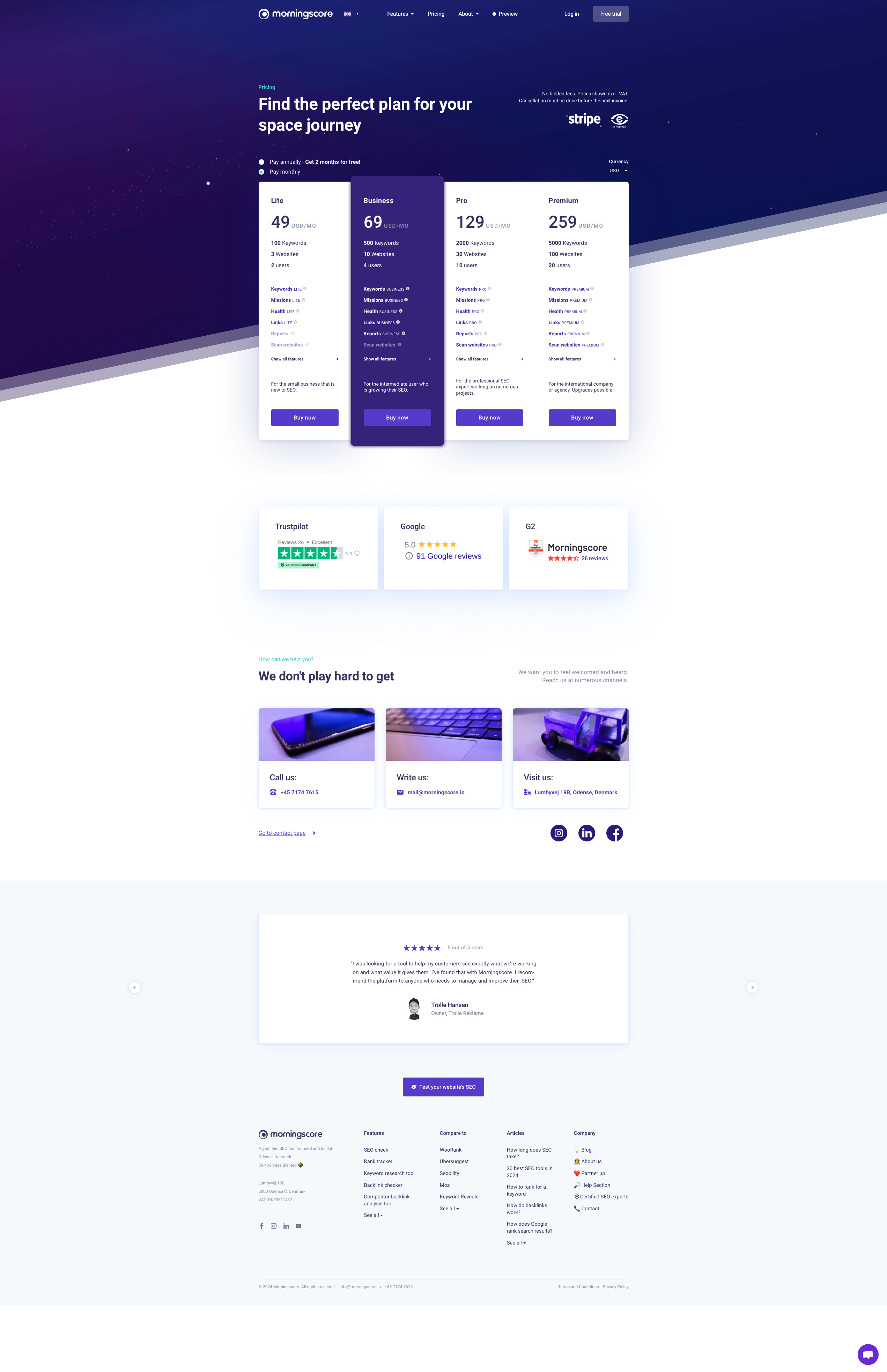
The "Before"
Morningscore's old pricing page had a lot of room for optimization.
Several things stood out to me:
- Headline was too brand-focused (too metaphorical) without a clear value prop
- Too many distractions in the hero and right above the pricing table
- Pricing-tier persona descriptions were in the wrong place
- Feature copy was not clear enough
- Pricing card CTAs were non-specific, high-friction, and had poor placement
- Monthly/Annual toggle was not easy to see or click
- No FAQs
- Free-trial offer was easily missed
- And a few other things
As you can see, a simple pricing page has so many moving parts, and many of them have a ton of room for improvement.
Here is the BEFORE:
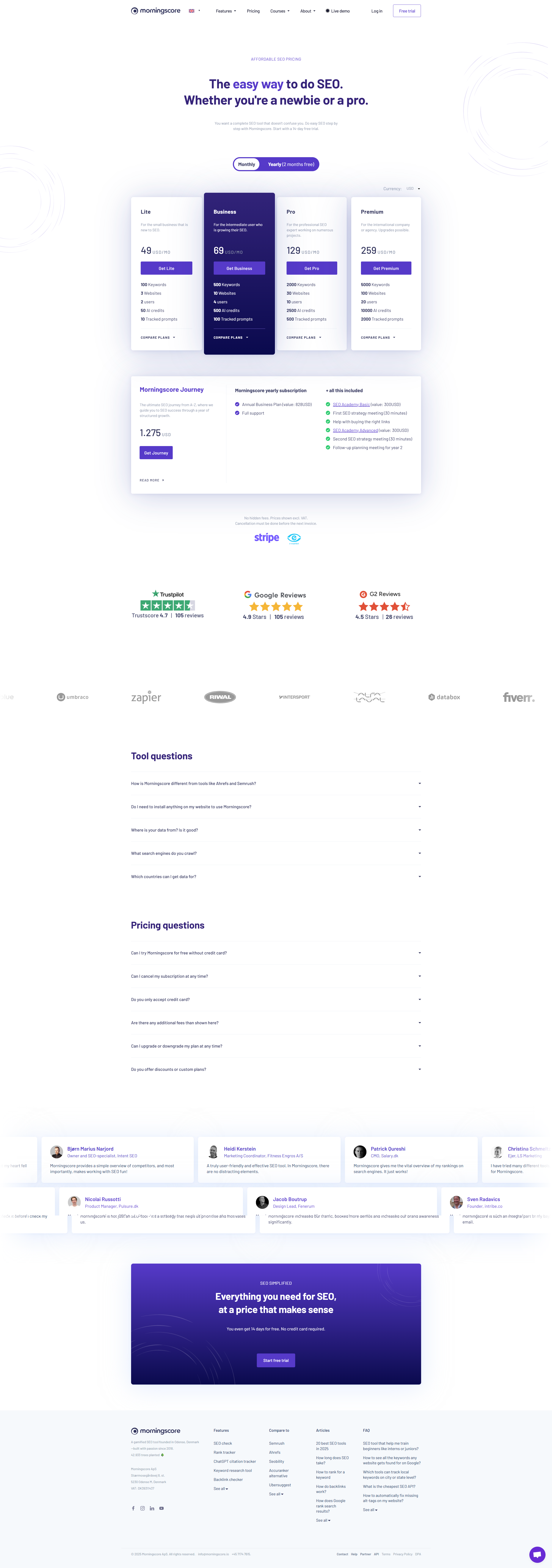
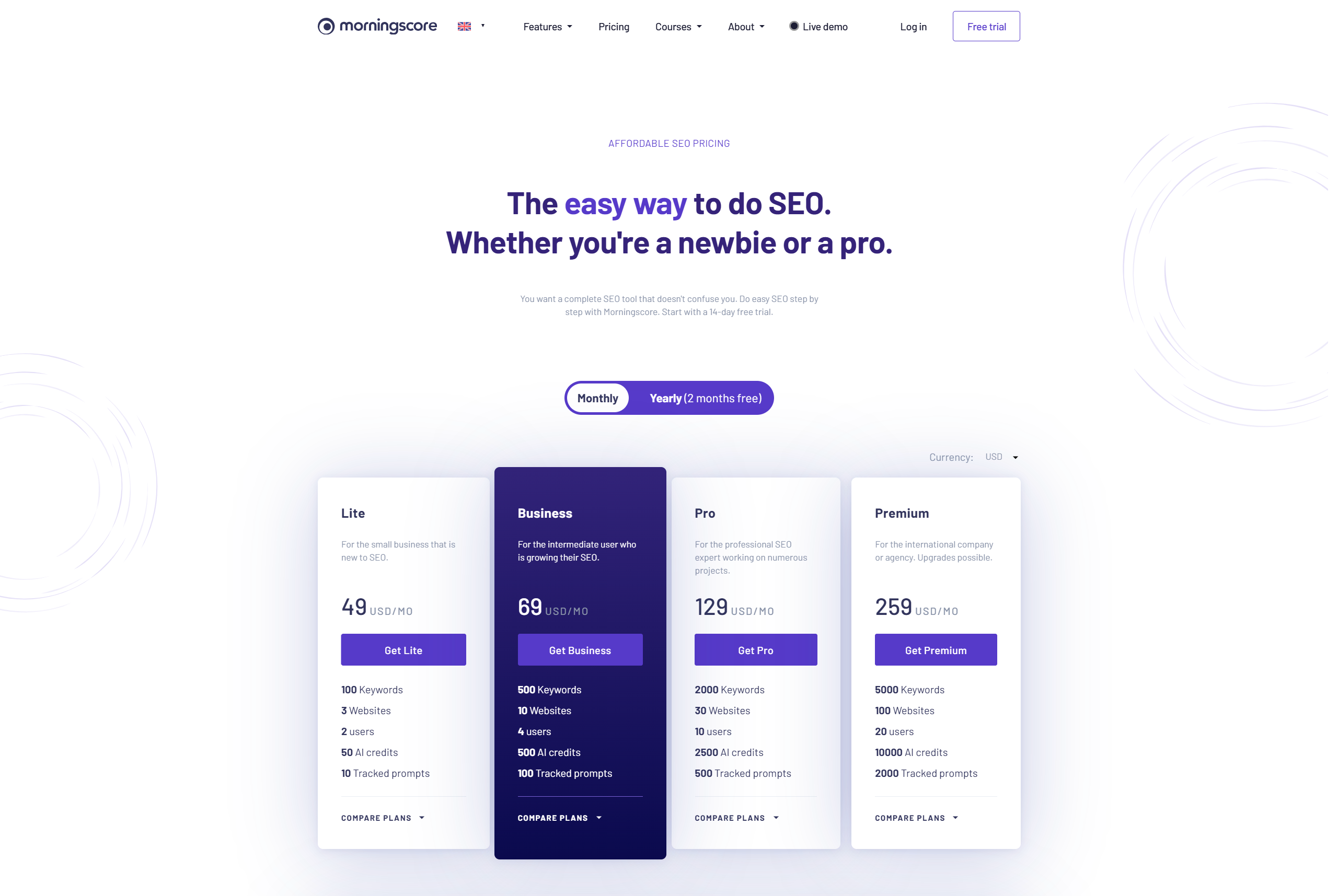
The "After"
For the pricing page optimization project, I recommended:
- A new header andsubhead
- Restructuring of the pricing cards
- Clearer feature copy with better use of tooltips
- Lower-friction pricing card buttons with more specificity
- Better use of customer review quotes
- Bigger spotlight on the free-trial offer
- And a few other things ;-)
Here is the new pricing page:
More cool projects

Ready to see your website copy up leveled?
Let's chat! 😉


