SaaS company websites all tend to sound the same.
This is something many marketers, messaging strategists, and copywriters love to point out.
“There’s so much noise.”
“It’s a sea of sameness.”
“They’re all saying the same thing.”
But have you ever asked yourself why that is?
What exactly makes B2B SaaS websites sound the same?
People are quick to point fingers at ChatGPT. But the problem with sameness existed long before ChatGPT.
There are a number of reasons B2B SaaS companies sound so insanely similar — like:
- Buzzwords (ever seen “supercharge”?)
- The copycat problem (companies copying competitors or websites they idolize)
- Landing page templates
- Vague, business-level outcome messaging
- The same 5 marketing agencies servicing SaaS companies
And yes, the fact that everyone’s using ChatGPT only exacerbates this problem (but it isn’t the sole cause).
However, I’ve identified a pattern on a more nitty-gritty writing level.
I admit, it’s more in the weeds, but once you become aware of it, it’s so obvious. Most importantly, it’s also easy to fix. (Even if you’re using landing page templates. Or getting “inspiration” from competitors.)
The culprit: when capabilities start to sound like commands
Ready for the reveal?
It’s the imperative clause.
Too grammatical?
OK, translation: Speaking in commands. 📢
Commands?
Yes, here are some examples from real sites:
- “Scale your knowledge.”
- “Deliver service faster.”
- “Supercharge your devs’ productivity.”
- “Enhance your teams’ work with AI.”
- “Unleash the power of teamwork.”
- “Connect work to company-wide goals.”
- “Take the guesswork out of decision-making.”
- “Bring your strategy to life.”
You get the point.
The formula is: [Active, transitive verb in 2nd person POV] + [predicate]
Lots of writers just simplify it to: [Verb] + whatever.
And I can hear the objections already:
I thought active verbs were effective!
Isn’t this a website best practice?
It’s a great way to explain what customers can DO with our product!
Yes. Absolutely. 100%.
These headers help us write more concrete, specific, customer-focused messages. And yes, it is important to talk about the capabilities your product features enable.
However, what happens when nearly all of your headers down the page follow this sentence structure?
There IS such a thing as “too much of a good thing.”
In this case, the website begins to sound monotonous. Same cadence, same tone, same rhythm.
Not to mention, if you read these headers in isolation, the company starts to sound like it’s talking at you, telling you what to do. Kind of like a crabby parent or a micromanaging boss. It’s the exact same sentence structure:
- Load the dishes.
- Walk the dog.
- Wash your clothes.
- Finish your homework.
- Submit your report by Friday.
- Schedule your holidays on time.
- Renew your parking permit tomorrow.
Imagine your ICP visiting multiple competitor sites and encountering these types of headers the whole time. Those websites all have the same “ring” to them.
Remember, silent reading has a sound. Most people, when they read something inside their heads, hear what they’re reading.
What does your brand voice sound like to them?
The cure for B2B SaaS monotony
Should you stop writing in imperatives?
Absolutely 1,000% NOT.
As I said earlier, imperatives (“commands”) are a great writing technique.
They facilitate clarity, concreteness, and customer focus. (As long as you don’t use buzzwords — er, buzz verbs — like supercharge, unleash, elevate, or streamline! But that’s a whole other topic.)
All you need to do is add some variation here and there. Try the 80/20 rule. Or maybe even 60/40. So, ~60% of your headers use the imperative, while 40% can be a mix of other types of phrases and sentences.
“But what other types of headers can I write?”
I’m glad you asked. I’ll walk you through 8 ways to spice up your headers — with examples from web copy I’ve written and web copy I have a crush on. 🙂
1. Spotlight the problem
Talking about the problem your product solves is critical on homepages and even product pages.
And when you call out the problem your ICP is likely experiencing (i.e., the problem that’s ultimately driving them to look for a new solution), you naturally don’t write in imperatives. I.e., You’re not telling your reader what they can or should do; you’re just describing their situation in an empathetic way.
Here are several examples:
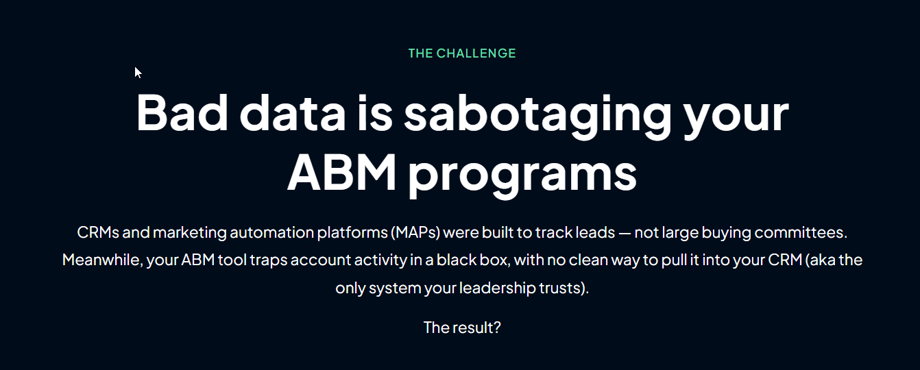
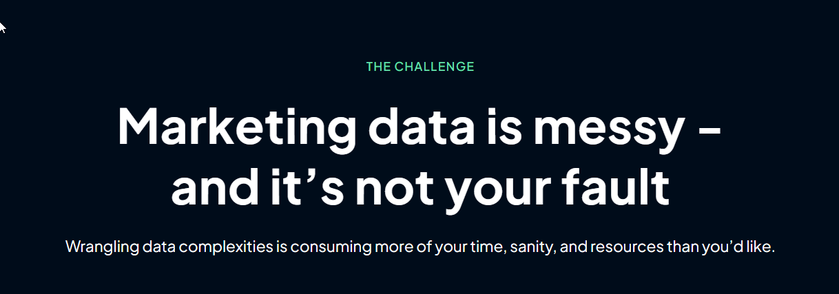


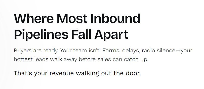
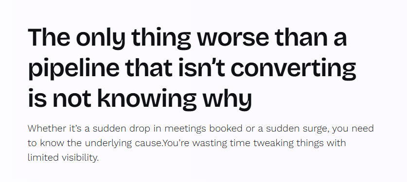
These problem-centered sentences/phrases get your audience’s attention because you’re mirroring the pain of their status quo. It doesn’t feel like you’re twisting the knife. It feels more like empathy. You’re telling them, “We get it. We understand what you’re experiencing right now.”
The right people (your ICP) pay attention because in talking about their problem, you’re talking about them. You’re talking about their situation. And people love to hear about themselves before they hear about your product.
A problem statement also creates relevant framing for your solution. It positions your product as the cure / painkiller. It’s a great persuasion technique and taps into buyer psychology.
These statements also create a nice pattern-interrupt and contrast to the imperative headers on your page. (Often, your hero headline will be an imperative. So it’s nice to follow that up with a problem-focused statement, which then creates a perfect segue to introduce your solution features.)
2. Help them imagine a benefit or result
A great way to introduce a product block, other than using the imperative, is to describe a benefit or tangible outcome.
It’s a form of “future pacing.” Future-pacing is a powerful persuasion tool because you’re painting a better version of your prospect. You’re showing them what success can look like. As Bob Moesta says in his book Demand-Side Sales, “People don’t buy products. They hire them to make progress in their life” (p. 30). Your prospect doesn’t want your product per se; they want the transformation your product is supposed to deliver.
Even better, try to start the header with the second-person pronoun “You.”
Here’s an example:
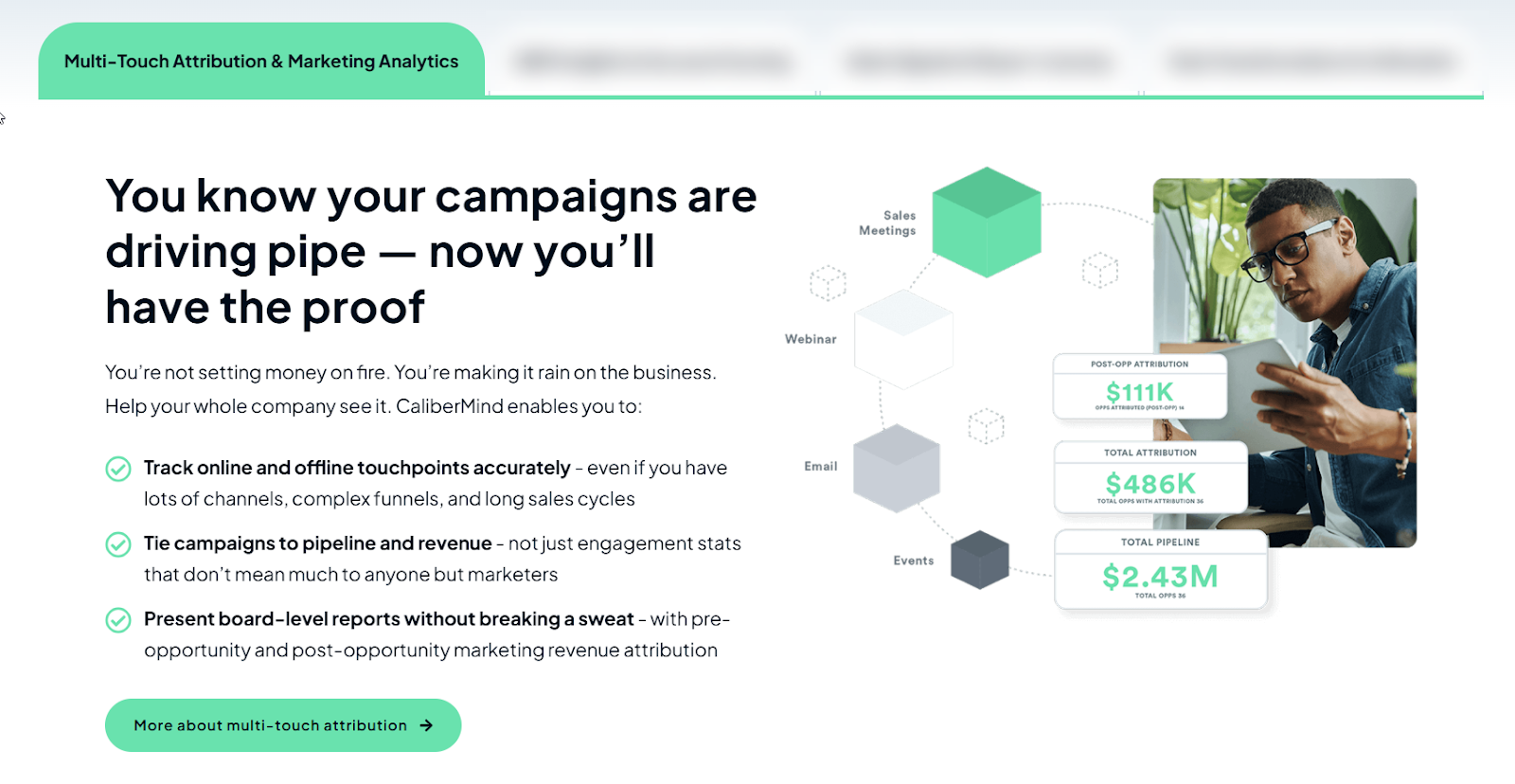
Speaking of “You,” a 2022 study , published by the American Marketing Association, found that second-person pronouns — you, your, you’re, etc. — in content gets readers’ attention, makes your content more engaging, and builds a positive brand connections and attitudes.
That’s the main reason I intentionally write a good number of headlines that either begin with a second-person pronoun or include them in the line. For example, if you want to write “Train employees faster,” you can make a tiny but potent change by adding the possessive second-person pronoun like so: “Train your employees faster.”
Anyway, if a “You” statement doesn’t fit what you’re writing about, simply describe what your buyer will get.
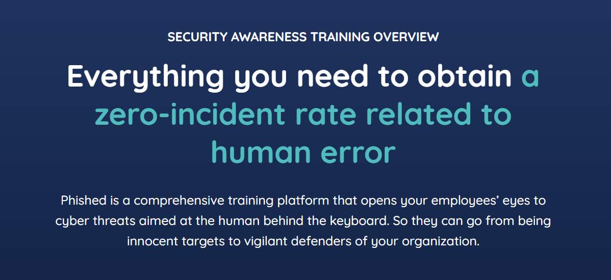

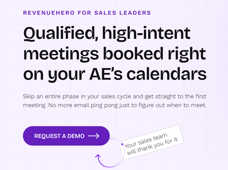
To recap, simply write down a benefit, result, or outcome, and try to be concrete or specific. What's the thing they can expect to get? The thing that'll make them feel like they're making progress in their life.
3. Start your header with “Let’s …”
Another easy way to switch up your syntax is to start a header with “Let’s [and then describe the outcome you help prospects achieve].”
Here’s one I wrote for a client in the security awareness training space:
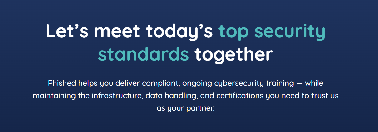
Here’s another example, from ClickUp:

This is such a great use of “Let’s,” because it’s part of a before-and-after framing. It spotlights the buyer’s problem and pain points and immediately contrasts it with the promise of the new solution. It positions ClickUp as a product you can hire to make Bob-Moesta-style progress in your life. :)
I just recently spotted Basecamp using a “Let’s” header:

I love what they’ve done here because they’re about to show you how the product works. It’s a great way to intro a product/feature section.
Just be careful not to use this technique too often, though. Sprinkle it on your site no more than a couple of times.
Here’s an idea:
Try writing a “Let’s …” header when you’re describing product onboarding, support, or professional services. That makes the visitor feel like you’re on their team and taking a burden off their shoulders.
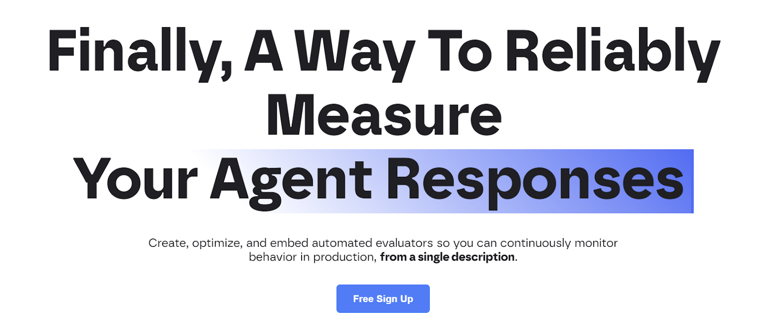
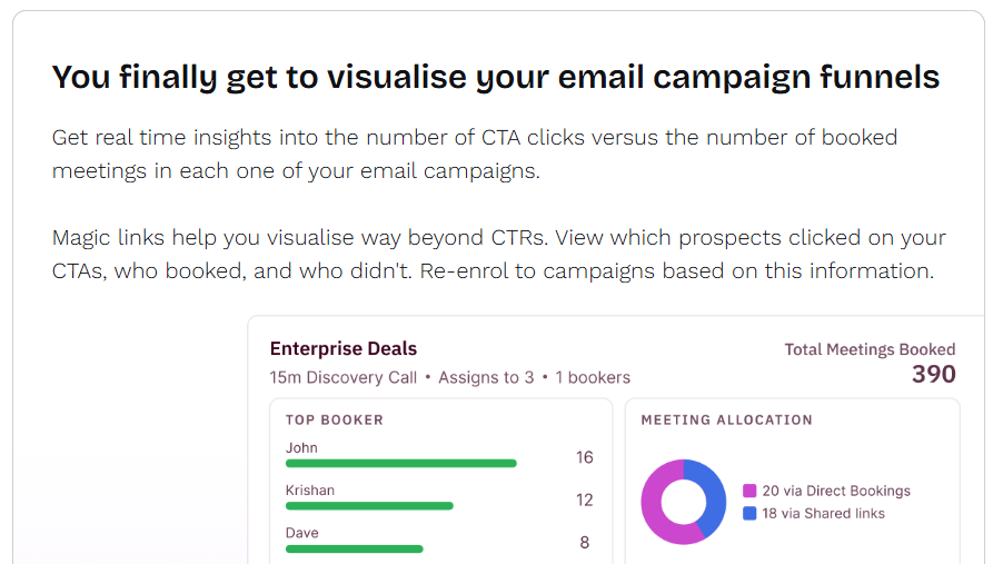
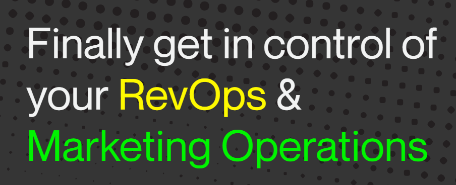
4. Express relief from the POV of a buyer: “Finally, …”
The word “Finally” grabs attention and creates a feeling of relief. So whatever comes after it must be the antidote to a problem or pain point your prospects are feeling the most right now. Of course, for this kind of header to land with your reader, you must pick on the struggle that’s driving them toward a new way of working.
So take whatever is standing in the way of your prospect’s success and turn your product or service into the solution that makes that problem or pain go away.
As usual, here are a few examples:


Just like the “Let’s” examples, make sure you don’t overuse “Finally.”
Never more than once on a page. Max 2 or 3 times across a multi-page site.
5. Ask a rhetorical or open-ended question
Questions, especially when you don’t overuse them, are such an effective buyer-psychology hack. It’s been proven that copy in the form of a question often performs better than the statement version of the copy.
I would add that in web copy, you should aim for rhetorical or open-ended questions rather than closed questions. Open-ended (or, loaded) questions don’t have a yes/no answer. If the reader were to actually answer them, they’d be answering with a phrase or statement.
Here’s an example of a header I wrote for a client:

In the above case, I used an open-ended question to nudge the prospect to book a demo. In effect, I’m starting the conversation that a sales rep would ask. This is at the end of the webpage.
Now check out this incredible example I found on RevenueHero’s homepage:
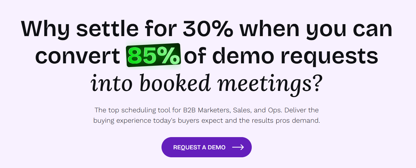
I friggin’ love RevenueHero’s loaded-question header here.
It accomplishes so many things:
- Promises a specific, tangible outcome using numbers
- Paints a before-and-after transformation
- Uses a second-person pronoun (“you”)
- Is ultra specific about the capability
- Makes an offer no rational person would refuse
Here’s another one. (They really crush it in this area.)

This isn’t just any loaded question. It’s an objection-style question that echoes what a prospect might be thinking in their heads.
So this header accomplishes several things:
- Starts with a little dash of future pacing: “Meetings are booked. Great!”
- Addresses a common follow-up question/objection.
- Breaks the fourth wall by voicing the question in the voice of the customer.
- Makes it super clear what the following product section will be about.
- Entices the reader to keep going.
I did something similar for a client here:
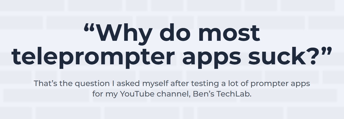
I did two things intentionally here:
- Ask a loaded question that brings up the challenges and pain points of using other solutions (reminding the reader why they’re searching for a new way of doing things)
- Enclosed the question in quotation marks because quotation marks are even more attention-grabbing and do a better job of breaking the fourth wall
Here’s an example of where a closed question works well:
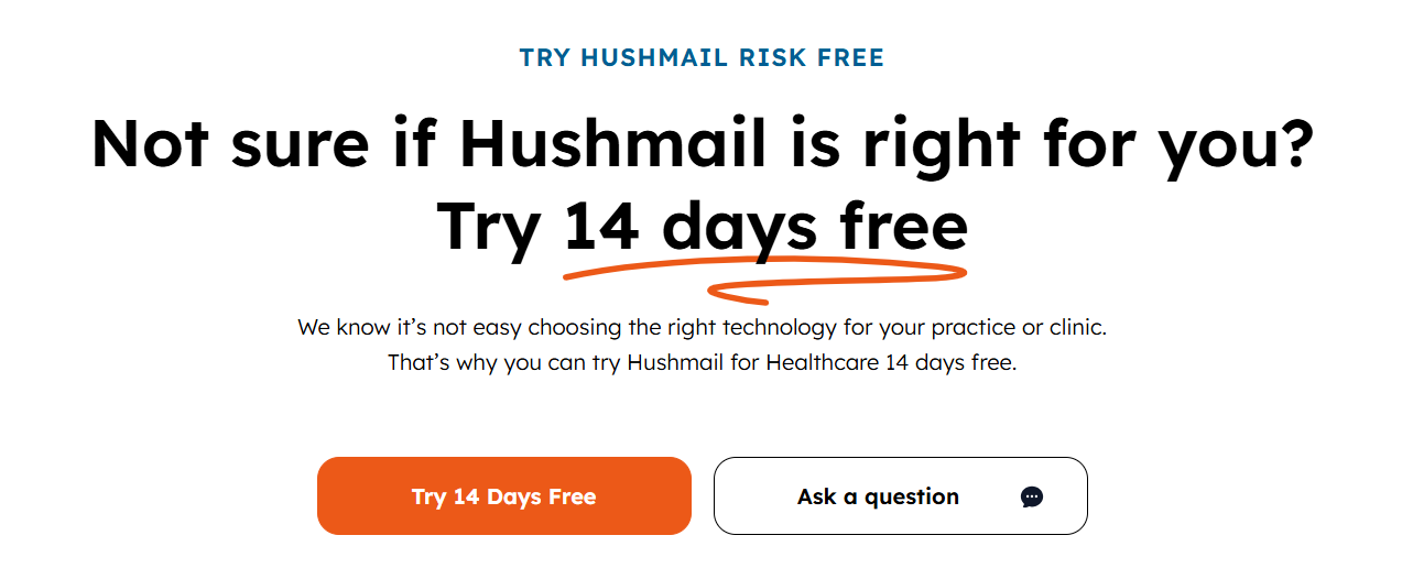
So let’s back up for a moment.
Why do I generally advise against closed (yes/no) questions?
It’s because there’s a really good chance your prospect will answer no — either snarkily in their head or by simply not taking action.
So many websites write questions that start with “Ready to …?” It sounds insecure and perhaps even pushy. And when the visitor’s answer is “no” (which is often), it creates an awkward moment. It’s also terribly overused.
The reason I made an exception in the above example is that I based it on voice-of-customer research. I had good reason to know that our buyers are often unsure and hesitant because they are making a purchase in a category they feel like they’re not an expert in. They need guidance, assurance, and risk reversal.
Also, even though it’s not an open-ended question, notice this:
- The question is phrased in the negative — “Not sure …?” This isn’t pressure to take action; it’s empathy. Also, that means I’m leveraging a buyer-psychology principle called negativity bias.
- The answer wouldn’t truly be yes or no. It would be more like a nod. And regardless of what the visitor’s internal response is, I’m using the question to introduce our offer.
So even though grammatically this question is a closed question, it functions like a loaded question and does not lead to an awkward silence.
You can see a similar example I wrote for another client here:
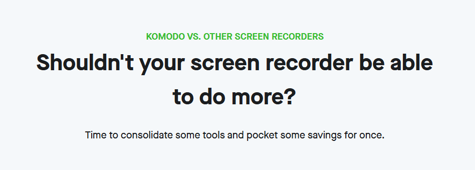
It IS a yes/no question, but it’s actually a statement of agreement with the visitor. And it, too, uses negativity bias. :)
Lastly, Revenue Hero crushes the question technique in the best way.
Check this out:
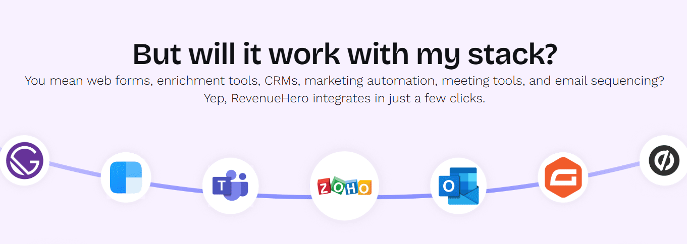
What they’ve done here is ask a question in first-person point of view! In other words, they break the fourth wall and ask it as if the website visitor is asking it. “But will it work with my stack?” Just brilliant.
And then they provide the answer. This is another rare occasion where closed questions work. They’re stated in the voice of the customer, and you’re providing an answer (not them).
TLDR: Ask more questions. Ask better questions. This is how you add voice, variation, and vibrancy to your web copy.
6. Straight from the horse’s mouth
Another one of my favorite ways to shake things up when it comes to headers is using a customer pull-quote as a header.
When you take copy straight out of the horse’s mouth, your messaging mirrors what your visitors are likely thinking. It’s also an excellent way to pre-empt objections and supply proof!
Here are some examples:
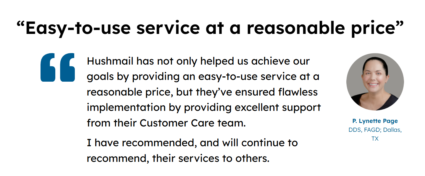
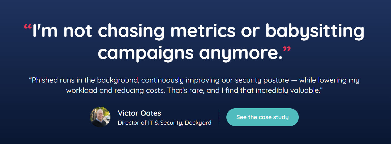


In fact, testimonial sections are often such a missed opportunity.
So many companies preface testimonials with “Don’t take it from us” (which might have been clever for the first two websites to use, but then everyone copied it). Also, it’s not actually saying anything valuable.
Another thing companies often do is not add a testimonial header at all. Unfortunately, the testimonial looks like a wall of text. A pull-quote header is a great way to pick out the most important message so even skimmers get something from your social proof.
Pull-quote headers or VOC lines aren’t only useful in testimonial sections. You can get creative and use them as one-liners for product sections or to preface your FAQ section. Think outside the box.
VOC lines are a great way to make your webpage sound conversational rather than a one-way street where you’re the only one talking to or at your visitor.
7. Talk about the transformation (before-and-after)
I’ve already touched on how important it is for us to paint a buyer’s transformation. Think of it like a before-and-after. We see this in B2C all the time, like a fitness coaching program showing the before and after of a client.
To an extent, we leave this type of messaging to case studies and testimonials.
But you can also do it in other ways.
One way is to write a “From … to …” header. Here are a couple I wrote for clients:

The moment you start thinking about before-and-afters, creativity sparks.
There are SO many ways to message that transformation — with words and illustrations:
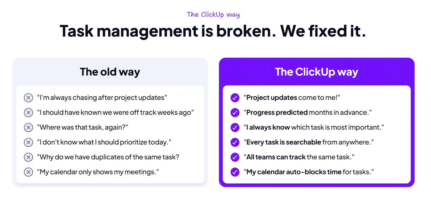
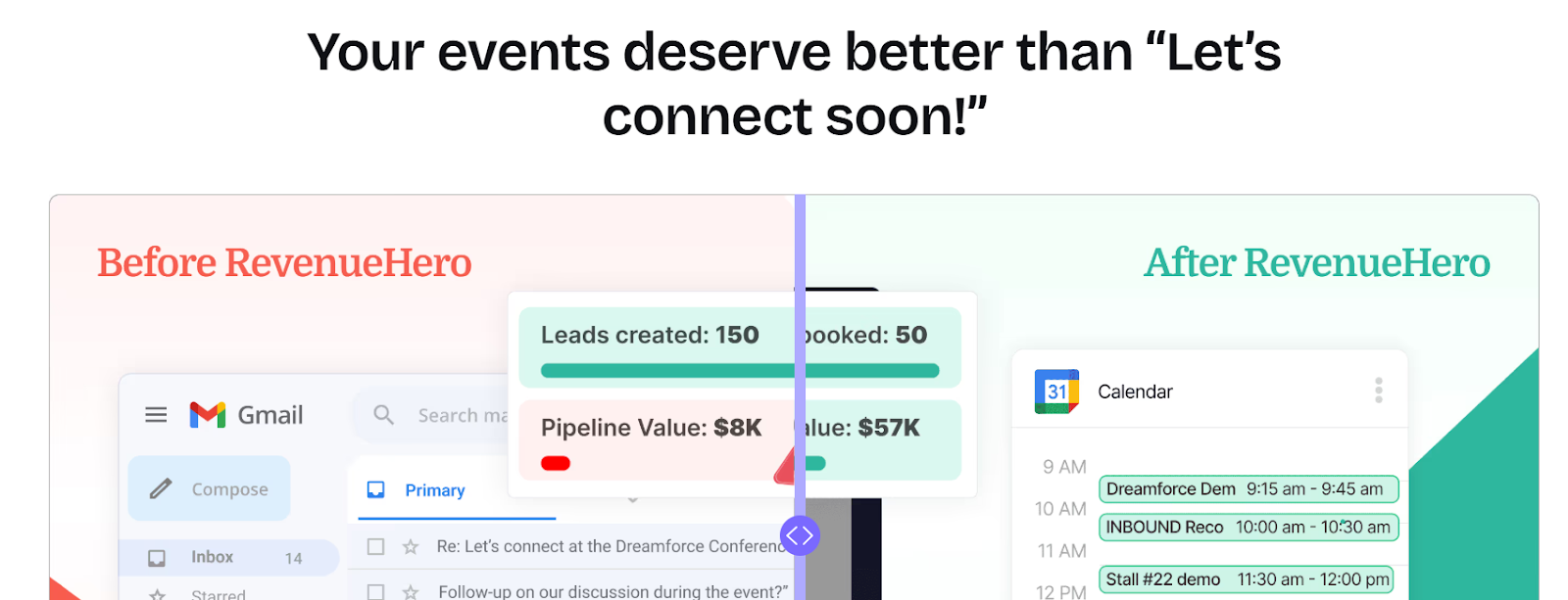
A super cool thing about RevenueHero’s method is that several of their pages have a before-and-after visualization (and a great header to go with it), like the one above. And the slider is a UX interaction! You can move the slider left and right to reveal more/less of both the “Before” and the “After”! So clever, so interactive, and yet so on point messaging-wise.
Also, this type of message is where an imperative statement works really well. As in, even if the rest of your webpage has lots of imperatives, this one isn’t as noticeable because you’re not telling the prospect what to do or what they can do. The focus is on progress:


Show your buyers who they’ll become.
Show them how your product or service will help them get there.
Use UX and conversion copy to both show and tell.
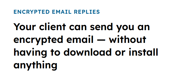
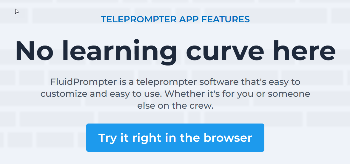
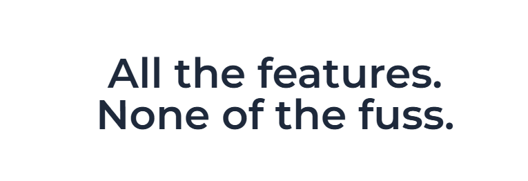
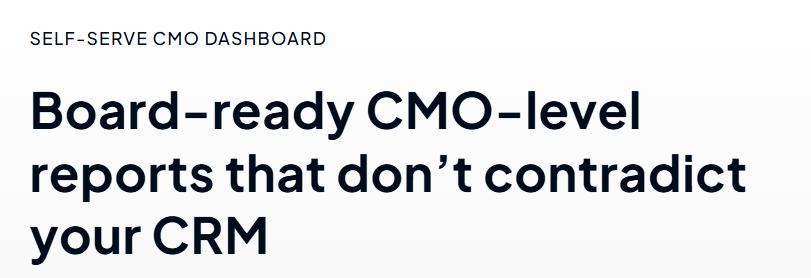
8. The thing they want — minus the thing they don’t
Lastly, I’ll feature one more technique/framework, with several variations:
- “[The thing you want] without [the thing you don’t]”
- “[The benefit]. No [Old way of getting it].”
- “All the [good stuff]. None of the [bad stuff].”
- “[Get this] not [that]”
- “[The feature] that doesn’t/don’t [create a new problem for you]”
This puts laser-focus on the benefit and tackles an objection to boot!
Here are a few examples:



As you can see, this construct takes many forms, so you can get really creative with it. The “minus the thing you don’t want” part can be:
- A feeling, emotion, or frustration
- A negative outcome that’s common with other solutions/the status quo
- A barrier or limitation that’s common with other solutions
- An objection visitors/buyers tend to have in this category
And more.
As with most techniques, don’t overuse. You want to add variety in all kinds of ways:
- Short sentences vs long sentences
- Statements vs questions
- Imperatives (verb + X) vs everything else
- Minimalist single-phrase headers vs. maximalist multi-sentence headers
- Seriousness vs humor
- Your brand voice vs the voice of the customer
- And so on
Recap
OK, so let’s list out the 8 techniques all over again:
- Spotlight the problem — When you acknowledge your buyer’s problem and pain points, you’ll naturally steer away from imperatives for that section.
- Help them imagine a benefit or result — State what it is they deeply desire, the main thing they need your product/service to deliver.
- Try a header that starts with “Let’s …” — This is a really simple, easy-to-remember line that adds some variation to your headlines; just be sure to use no more than once per page.
- Express relief from the POV of a buyer: “Finally, …” — This can be cathartic for your reader, as long as it’s hyper-relevant (so you MUST nail your positioning and truly know your ICP); use very sparingly.
- Ask a rhetorical or open-ended question — Questions are proven to engage readers and website visitors, but be very mindful in how you construct them and how your visitor would answer.
- Straight from the horse’s mouth — When your customer says something, it’s 10x more powerful than when you say it. Leverage that VOC.
- Talk about the transformation (before-and-after) — Use headers to state how your product or service will change your prospect’s life. How will you take them from A to B?
- The thing they want — minus the thing they don’t — This is similar to No. 2 in this list, but with an added objection-handler. Plus, there are SO many sentence types to deliver this message.
So there you have it. Eight ways to spice up your headers. So you can wake up buyers’ brains, make them feel like they’re having a convo with you, and maintain their interest down the page.
Be bold.
Be different.
Be remembered.
Have fun!


